The Chicago-based Center for Neighborhood Technology has dramatically expanded its location efficiency mapping and analysis to 337 metropolitan areas across the country. This impressive resource details the housing and transportation costs associated with specific neighborhoods, along with neighborhood-based, per-capita driving rates and carbon emissions, for each region The work now covers basically every part of the US that is served by a metropolitan planning organization, or 80 percent of our country’s population.
At the same time, the organization released its new report Penny Wise Pound Fuelish, which may just be the most important document in the field of land use that you’ll read all year. Big-time congratulations to our friends at CNT for making this happen.
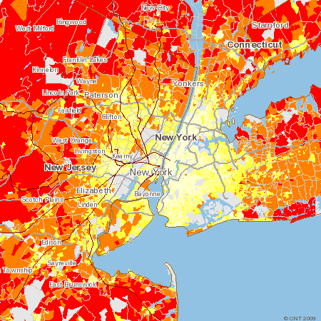
I have long been a fan of CNT’s great work, especially the GIS-based mapping that allows users to see at a glance the environmental and financial impacts of sprawl, and the benefits of smart locations in addressing both. Previously the analysis had been available for 55 metro areas — not bad, but imagine the work that went into the expansion.
CNT’s new report shows that only two in five neighborhoods in American communities are affordable for typical households when their transportation costs are considered along with housing costs.
The Housing + Transportation (H+T) Affordability Index covers 161,000 neighborhoods, and provides a comprehensive snapshot of the affordability of each by accounting for combined housing and transportation costs. With sprawl comes a greater distance from job centers, and that leads to less transit availability and fewer conveniences within walking distance. As a result the transportation costs rise, and in many places, the increased transportation expenses wipe out the perceived savings in housing costs.
In the organization’s press release, CNT states that, under the traditional definition of housing affordability (30 percent or less of household income spent on housing), 7 out of ten U.S. neighborhoods are considered “affordable” to the typical household. But in almost all metro regions of the country, when the definition of affordability includes both housing and transportation costs — at 45 percent of income — the number of neighborhoods affordable to households earning the area median income decreases significantly. Nationally, the number of affordable neighborhoods declines to 40 percent, resulting in a net loss of 48,000 neighborhoods with combined housing and transportation costs that stress the average family’s budget.
That’s the bad news. The good news, though, is that by encouraging smarter location decisions and smarter development, we can dramatically reduce financial burdens on American families, and in the process, we can get more vibrant, walkable neighborhoods.
As an environmentalist, my favorite part of the CNT work has always been the carbon mapping (see above image), which shows that per-household transportation emissions of carbon dioxide rise dramatically as one moves from relatively central locations to more sprawling ones (and, conversely, that emissions fall with smarter, more central and walkable locations). The pattern holds, more or less, for every metro area: the farther one goes out into sprawling areas, the more one is likely to be in the red areas of highest carbon footprint, and the closer one gets to the regional center and walkable suburbs, the more one is likely to be in the yellow areas of lower emissions.
Now that they are so widely available, I’m hoping that neighborhood transportation cost data will soon become part of what potential homebuyers seek routinely in real estate transactions, as is already becoming the case with Walk Score. CNT points out that “it is difficult for consumers and policymakers to estimate the full costs of a location, including the cost of both housing and of transportation. This lack of information can lead families to unknowingly make housing decisions that cause them to live beyond their means as gas prices rise and commutes grow longer. A community’s average transportation costs can range from 12 percent of household income in efficient neighborhoods with walkable streets, access to transit, and a wide variety of stores and services to 32 percent in locations where driving long distances is the only way to reach essential services.”

I have extracted the key charts and tables in a longer post on the subject on my NRDC blog, along with some additional analysis for those who are interested.


Comments